Amanda Kiss Real Estate | Brand & Website Refresh

Amanda Kiss is a Cochrane-based real estate agent known for her honest guidance, local expertise, and grounded presence in the community. Over a year after we first collaborated on her Squarespace website using her original DIY brand, Amanda came back to Modern Form Creative — still loving the site, but ready for a refined and elevated visual identity that would better reflect her growth.
We partnered on a full brand refresh, evolving her soft black and neutral palette into a richer, warmer brand direction grounded in deep browns and earth tones. The result was a more welcoming and elevated look that still felt true to her original aesthetic. Once the new brand was complete, we applied it across her existing website — keeping the original structure and copy, but enhancing every page with new brand visuals and updated styling.
The Deliverables:
Brand Identity Development
Brand Messaging: Brand Statement & Tagline development
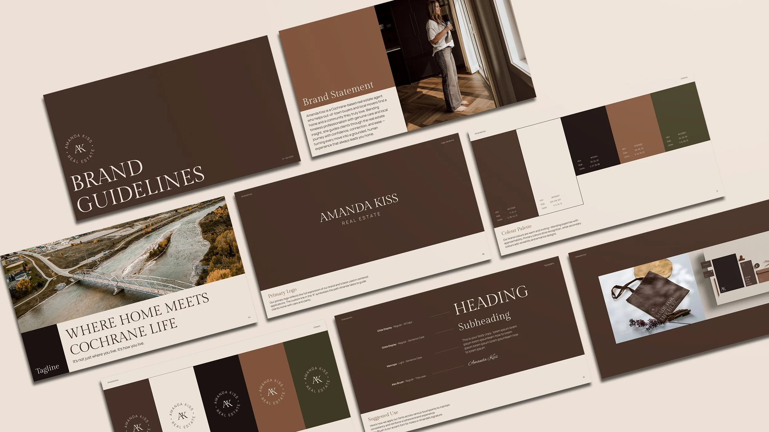
Brand Guidelines
Website Design Refresh (via Squarespace)
Visual Styling & Brand Integration Across Site
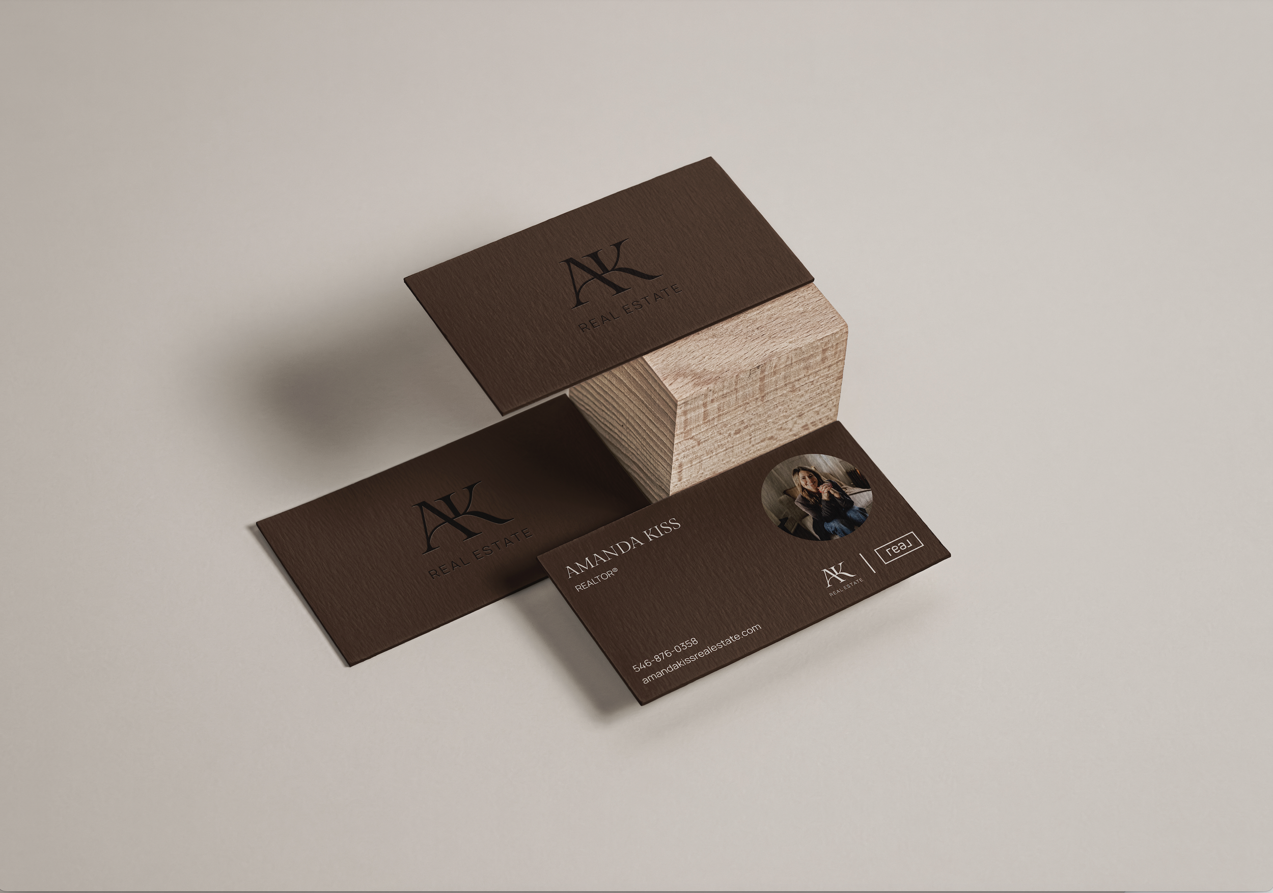
Business Card Design
Folder Design
Branded Gmail Signature


Objective:
Refresh Amanda’s brand identity to reflect her current presence as a real estate professional, while maintaining the personality and functionality of her existing website. The goal was to elevate her overall look without starting from scratch — keeping what was already working and polishing the rest.
Challenges:
Refresh Amanda’s brand without losing the dark, grounded aesthetic she was already known for — striking the balance between familiarity and elevated professionalism
Honour her existing following and local reputation in Cochrane by evolving the look, not replacing it
Maintain the integrity of a website Amanda still loved, while giving it a fresh new look
Ensure the new brand colours and fonts integrated seamlessly with the existing layout and structure
Evolve the look and feel without requiring major content or copy changes


Our Solution:
We approached Amanda’s brand refresh with the idea of creating a visual identity that feels like guiding someone home. The updated colour palette — a rich, grounding brown paired with soft neutrals — evokes comfort and calm, while still feeling elevated. Her new monogram-style AK submark was designed to subtly represent direction and movement, reinforcing her role as a steady, trustworthy guide in the real estate journey.
We began by creating a refined visual identity that felt aligned with Amanda’s existing style — but richer, more intentional, and more cohesive. We swapped the original soft black tones for a grounding, earthy brown and adjusted her neutrals for more warmth and elegance. From there, we applied the new brand throughout the site, updating section styling, typography, spacing, and colour accents to reflect the refreshed identity.
Results Achieved
Amanda’s brand now feels as professional, confident, and welcoming as the service she provides. Her updated website maintains the layout and functionality she was already proud of, but with a more elevated and polished presence that sets her apart in a competitive real estate market.