Amplify Aesthetics | Wix Website Redesign
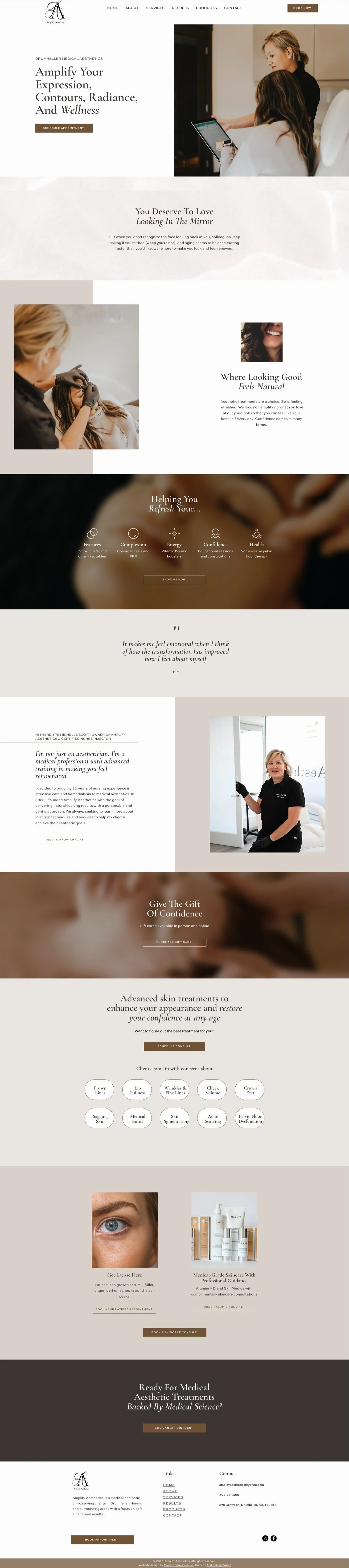
Michelle, a skilled cosmetic nurse serving Drumheller and Hanna, Alberta, came to Modern Form Creative with a DIY website and visual brand that no longer reflected the quality of her work. She wanted a site she could feel proud of — one that felt elevated, inviting, and built trust with potential clients. Our goal was to refine her visuals and bring her online presence up to the same standard as her in-person experience.
The Deliverables:
Custom Wix website design + build
Visual brand refinement (refined fonts, colour palette, layout direction)
Collaborative copy implementation (copy by Anika)
Creative direction
Challenges Faced
The old DIY website lacked structure and design cohesion, making it feel unfinished
Her visuals and overall branding didn’t reflect her clinical expertise or calm and kind personality
No clear user journey or guidance for clients ready to inquire
No testimonials for proof of client feedback
The old website didn’t focus on user experience, with barely any content or calls to action
Large but crammed sections made it hard to take in any of the content
Hard to tell what made her unique
No hero copy to help capture attention and communicate who she is and what she offers
No footer
Colours were grey and white and felt quite cold


Our Solution:
Refined Michelle’s existing brand visuals by updating the fonts and softening the colour palette to better reflect her calm, clinical expertise
Redesigned the website from the ground up using Wix, with a clean layout and intuitive structure
Crafted a clear homepage hero section to immediately communicate who Michelle is and what makes her unique
Added strategic content sections to outline her services, guide the user journey, and highlight her compassionate approach
Integrated testimonials throughout the site to build credibility and trust
Reorganized content into digestible blocks, improving readability and user flow
Added a proper footer for improved navigation and brand cohesion
Partnered with Anika to implement clear, strategic website copy that communicates who Michelle is, what she offers, and what sets her apart — ensuring it resonates with her audience
Results Achieved
The new website gives Michelle a cohesive and elevated online presence that matches the level of care and kindness she delivers in person. Clients can now easily understand her offerings, navigate the site with clarity, and feel confident in reaching out. With thoughtful visuals, structured content, and strategic messaging, the site positions Michelle as a trusted provider in the aesthetic space — and one her clients can connect with.