Leah Dermo, an Ontario-based real estate agent, came to Modern Form Creative looking for a more refined visual identity that truly reflected her personality and approach to real estate. She wanted a brand that felt warm, approachable, and timeless, without sacrificing individuality. Drawing inspiration from her appreciation for retro and mid-century modern design, we developed a sophisticated identity with rich, grounding colours and expressive typography that brings just the right amount of personality.
The Deliverables:
Mini Brand Identity Development
Brand Direction & Moodboard
Logo Suite Development
Colour Palette & Typography
Brand Guidelines
Objective:
Create a polished, cohesive brand identity that reflects Leah's personality and approach to real estate. The goal was to establish a distinctive visual presence that balances professionalism and trust with warmth, approachability, and a touch of unexpected character.
Challenges:
Incorporate red (a colour in her previous branding) in a way that feels warm, inviting, and sophisticated rather than harsh or overly corporate.
Balance timeless design with subtle retro and mid-century modern influences without creating an identity that feels dated or overly trendy.
Create a distinctive visual identity that reflects Leah's personality while maintaining the professionalism and trust expected in real estate.
Establish a recognizable personal brand that stands confidently on its own while still working cohesively alongside her brokerage's branding.
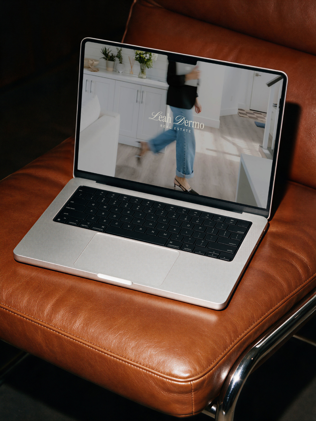
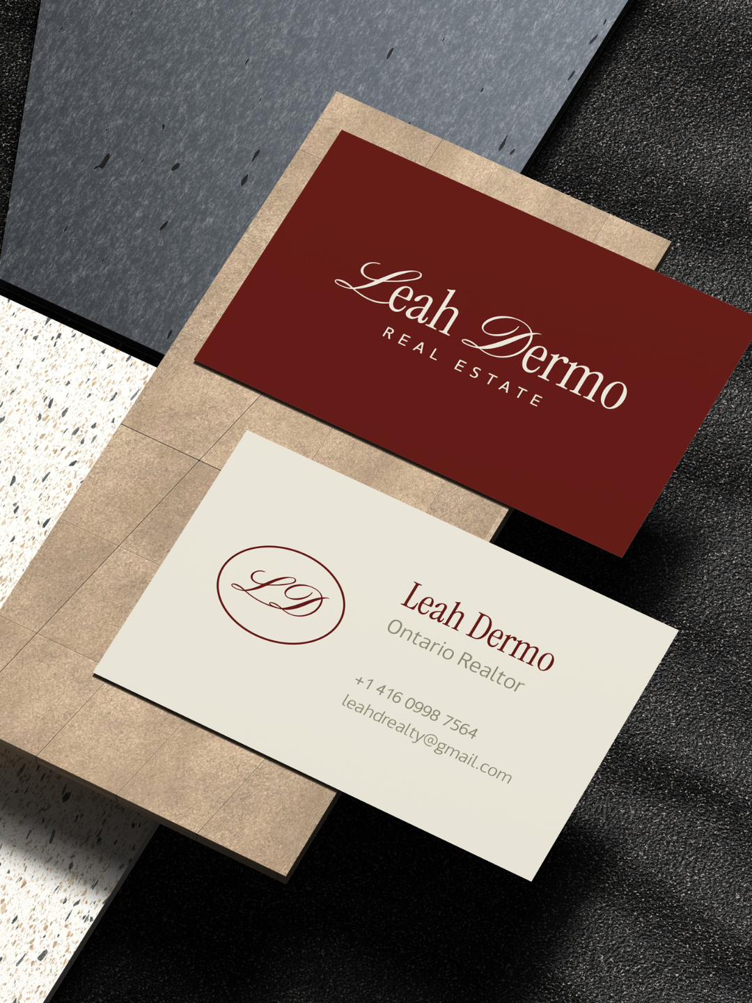
Our Solution:
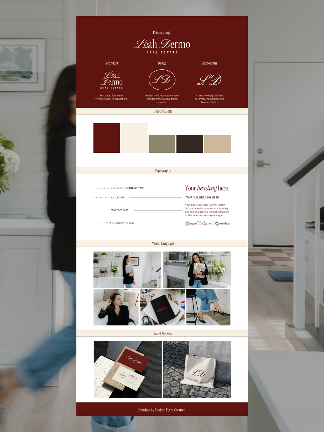
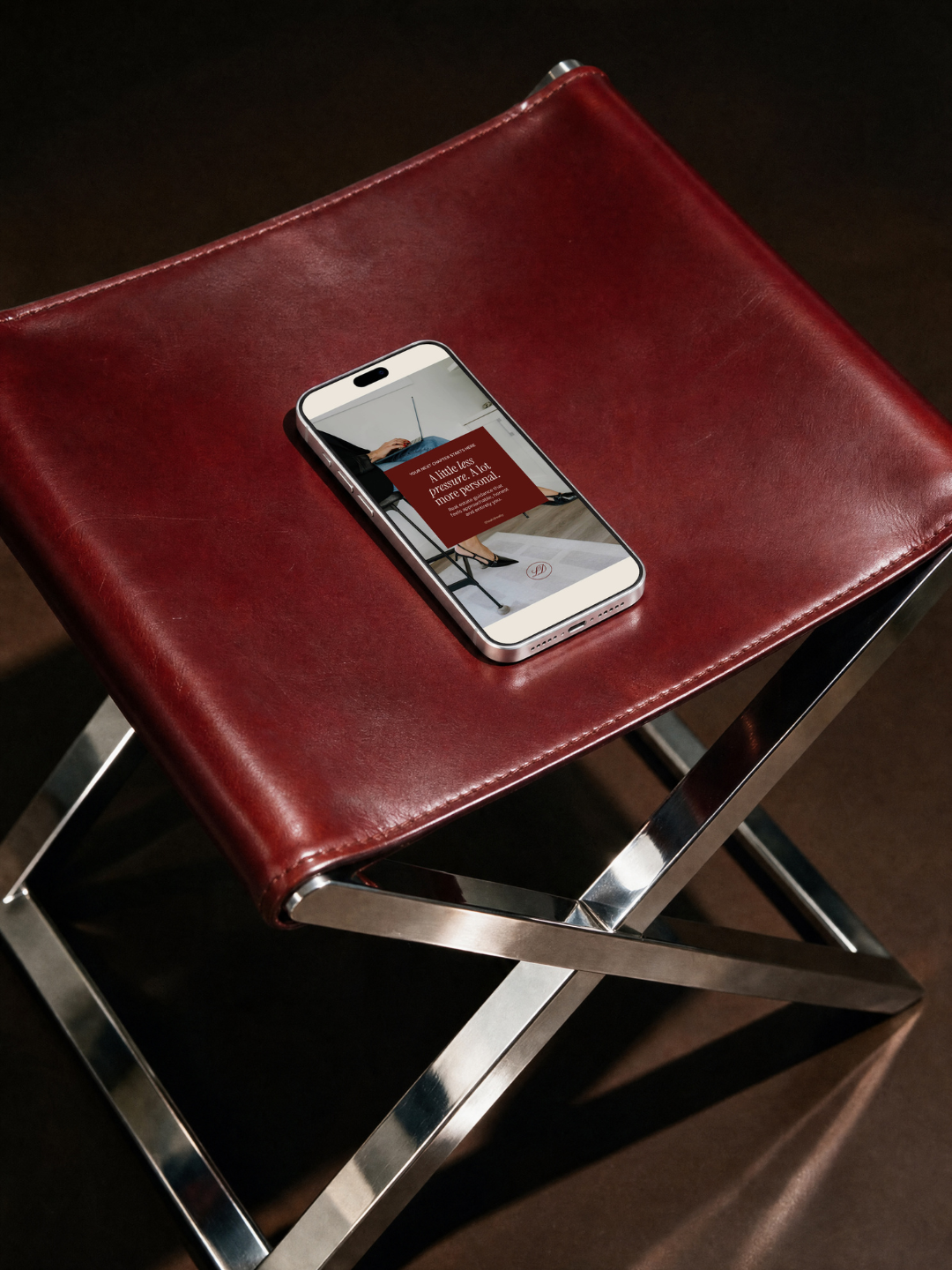
Brand Identity: Embraced rich burgundy as the foundation of Leah's new visual identity, pairing it with buttery cream, muted olive green, warm beige, and deep espresso brown. These grounding colours soften the boldness of red, creating a sophisticated, versatile palette that feels timeless, inviting, and distinctly her.
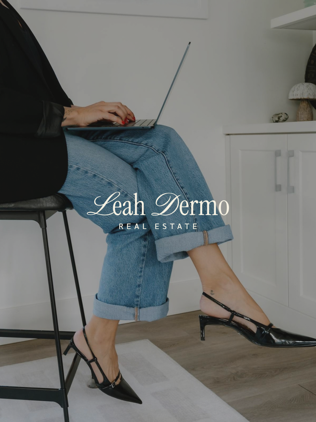
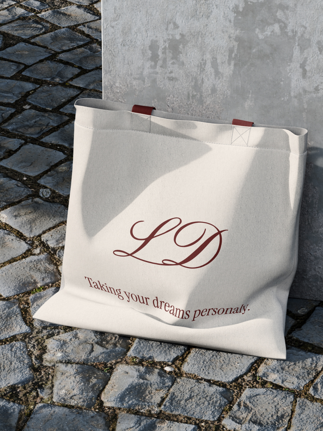
Logo & Typography: Developed an elegant logo suite featuring flowing script letterforms, a complementary secondary logo, and an LD monogram. Drawing subtle inspiration from retro and mid-century modern aesthetics, the typography introduces a touch of nostalgic character while maintaining a refined, contemporary feel.
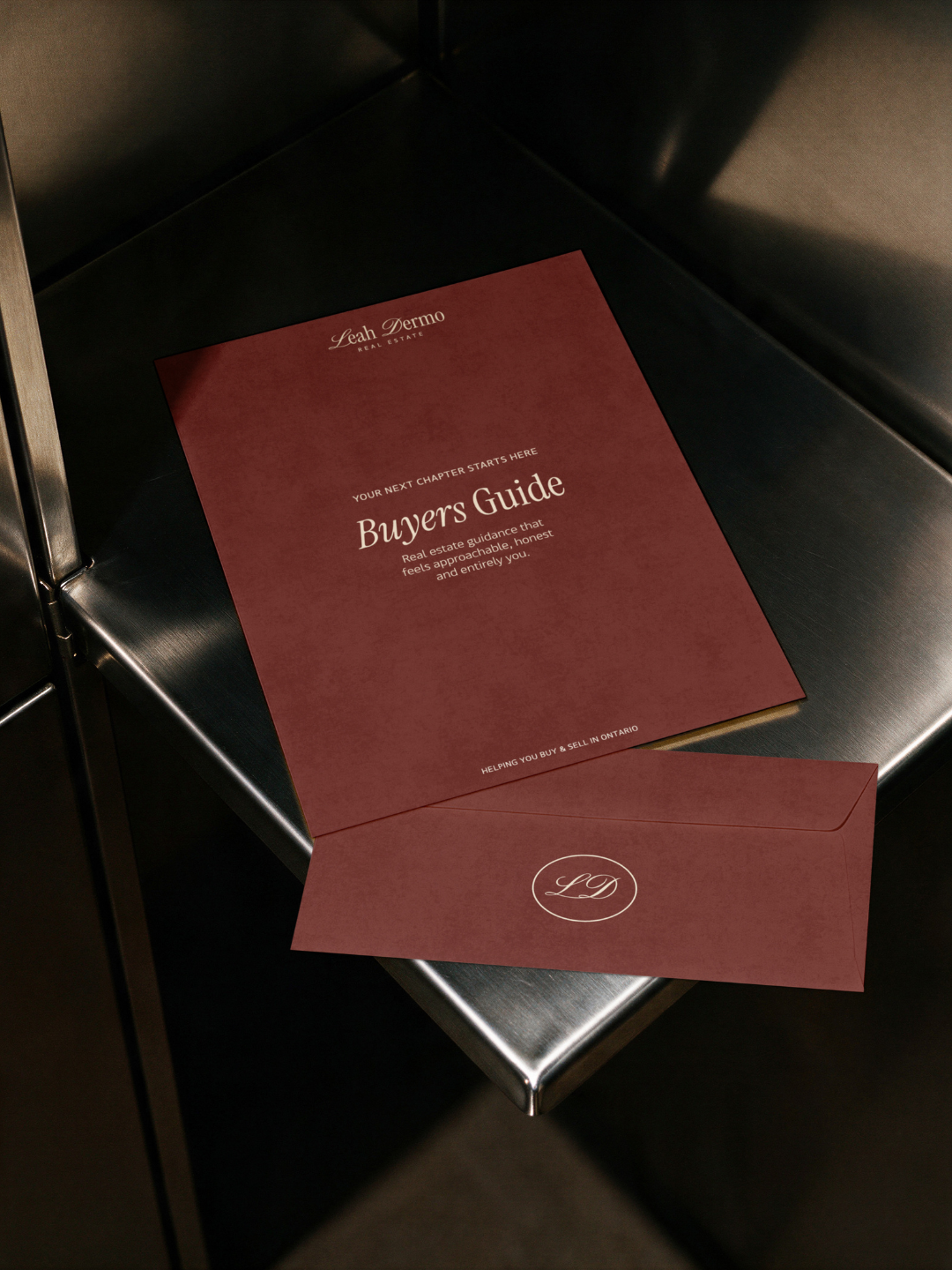
Brand Guidelines: Established a cohesive visual foundation through primary and secondary logos, a badge, monogram, colour palette, and typography guidelines, giving Leah the tools to apply her new identity consistently across digital and print applications.
Results Achieved
Leah now has a cohesive brand identity that feels polished, intentional, and distinctly her. The rich colour palette and expressive typography strike a balance between timeless sophistication and subtle retro character, creating a visual presence that feels warm, approachable, and memorable.
With a versatile logo suite and cohesive brand guidelines, Leah has a strong foundation to show up confidently and consistently across her business, with an identity that reflects her personality while standing apart in the real estate market.
