Yoga In Mocean | Wix Website Redesign
When Kirsten came to Modern Form Creative, her existing five-page Wix website no longer reflected the calibre of her work or the direction her business was heading. The site lacked clarity, structure, and intentional messaging, making it difficult for visitors to understand who she was, what she offered, and how to take the next step.
Rather than expanding the site further, we made the strategic decision to simplify. We transformed her scattered multi-page website into one intentional, high-converting landing page designed to clearly communicate her expertise and support the launch of her mentorship offering.
The Deliverables:
Strategic Landing Page Design (Wix)
UX Mapping & Customer Journey Strategy
Content Doc Guide with Prompts
Messaging Refinement & Headline Development
Brand Elevation & Visual Refinement
Mobile Optimization
Objective:
Create a focused, high-impact landing page that reflects Kirsten’s authority as a yoga mentor while guiding visitors clearly toward her mentorship offering. The goal was to simplify the user experience, strengthen her positioning, and ensure every section of the page worked toward one primary outcome: aligned inquiries.
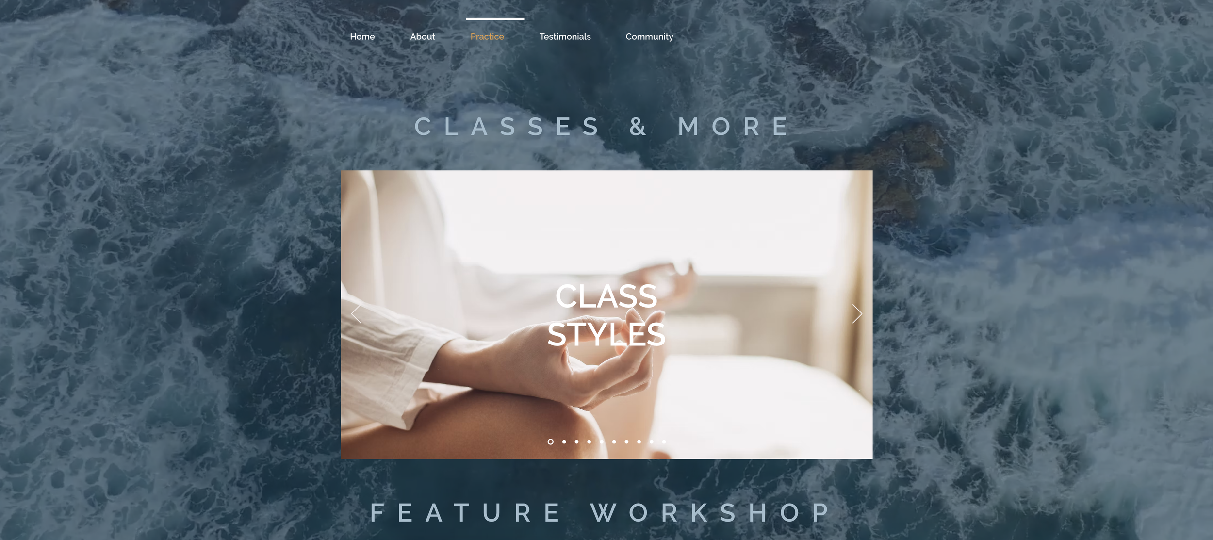
BEFORE - 5 PAGE WEBSITE
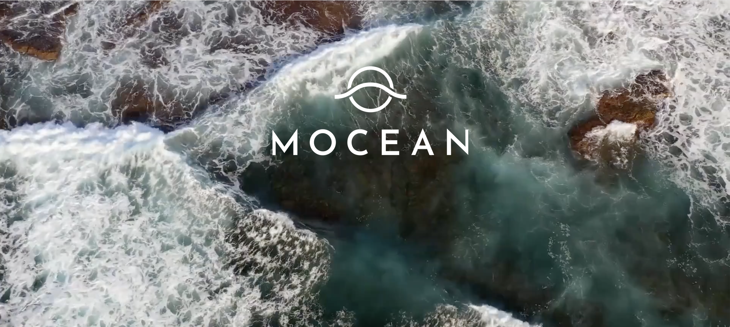
homepage - no links, nothing about the brand, no information. Looks like a coming soon page
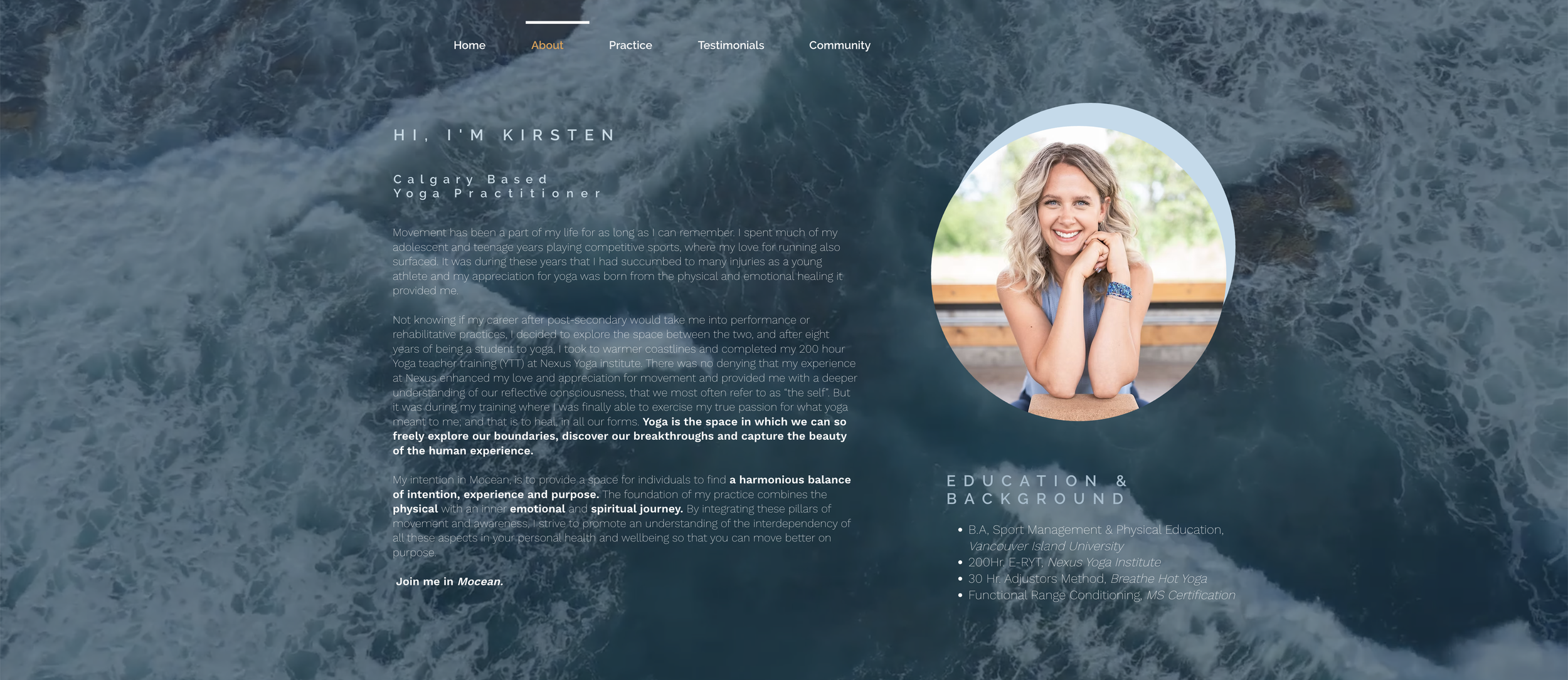
About Page - very light text, hard to read, no call to actions, lots of text making it hard to take anything away from this page
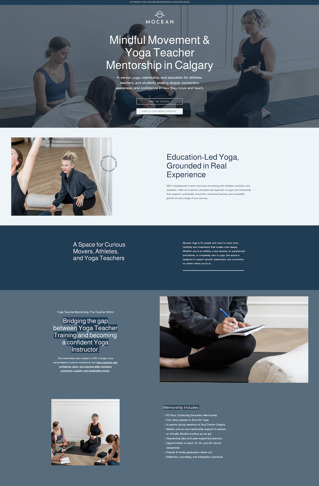
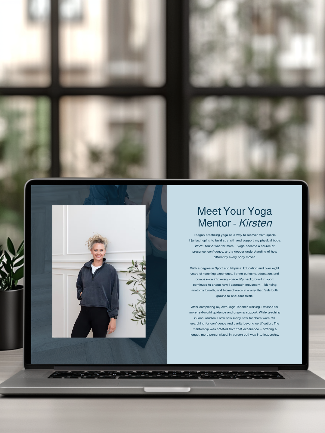
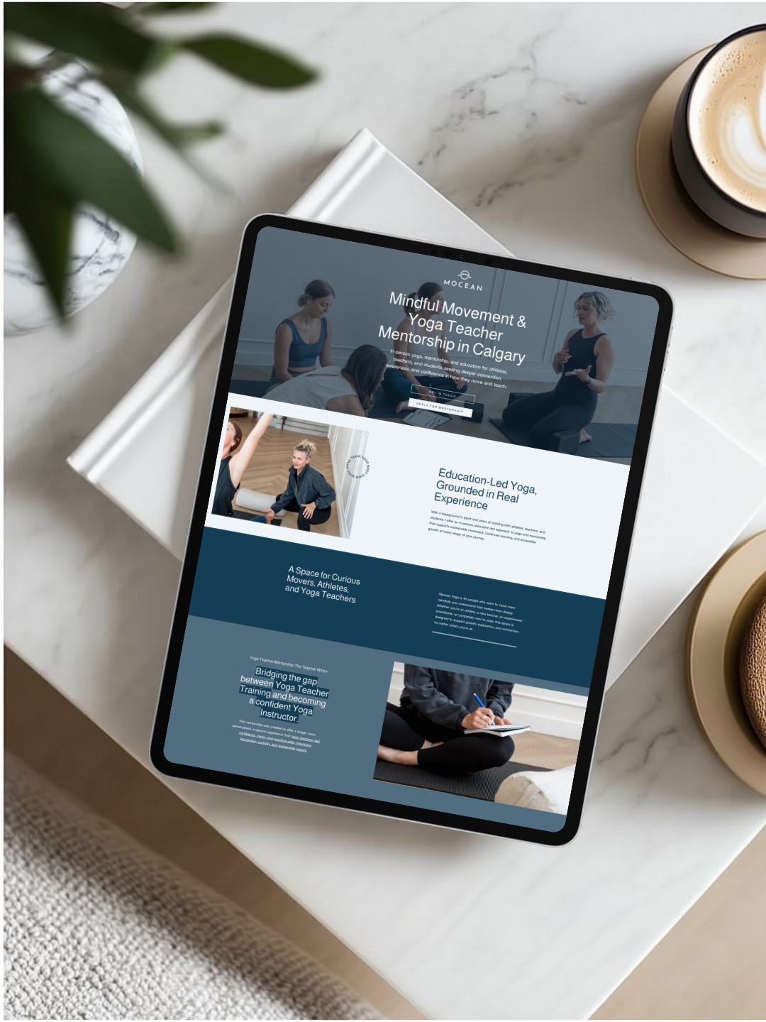
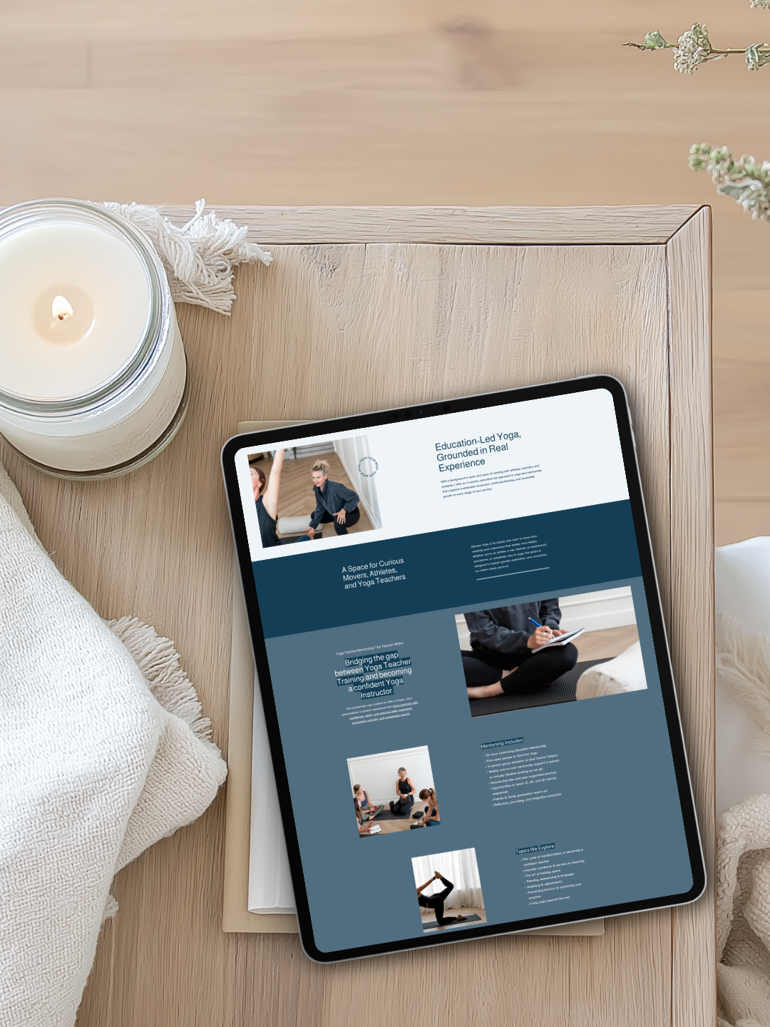
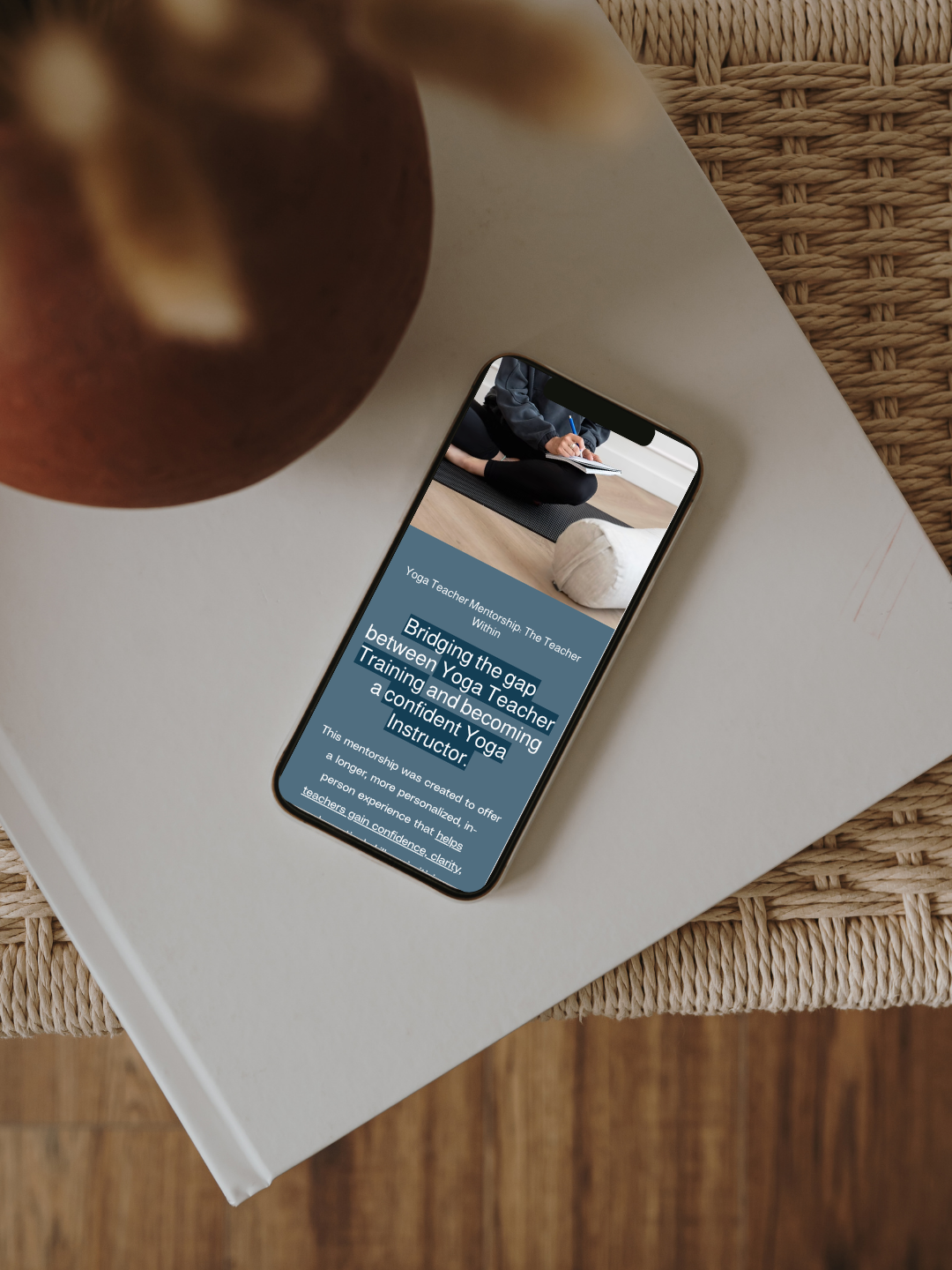
AFTER: ONE CLEAR & STRATEGIC LANDING PAGE
Challenges Faced:
No messaging on the homepage to introduce who she is or what she offers
Minimal content across pages, making it difficult for visitors to understand her expertise
No defined user journey or primary call-to-action
Light typography layered over a moving background reduced readability and accessibility
Brand elements existed, but weren’t being applied in a way that reflected her leadership or depth
Our Solution:
Consolidated the multi-page site into one strategic, high-converting landing page
Designed a strong hero section with clear messaging and dual calls-to-action, using a consistent primary CTA button throughout to guide visitors toward mentorship
Mapped out the full customer journey to clearly introduce her philosophy, expertise, offering, and next steps
Refined typography and elevated brand application to better reflect her authority as a yoga teacher mentor
Leaned intentionally into her colour palette to create a more confident, cohesive visual presence
Added structured content sections to improve clarity, flow, and positioning
Integrated testimonials to build credibility and trust
Reorganized content into digestible blocks for improved readability
Implemented a structured footer to strengthen navigation and brand cohesion
Added yoga teacher mentorship application page
Results Achieved
Mocean now has a streamlined and strategic online presence that reflects the depth of Kirsten’s work. Instead of a site that felt unclear or unfinished, she now has a focused platform designed to support her mentorship offering and guide visitors confidently toward the next step. Her brand feels more aligned with her leadership, her messaging is clear, and her website now works as a strategic tool — not just a placeholder.